


There is no doubt that visualization plays an important role in the achievement of goals along with manifesting dreams! In this article, we will interchangeably use these terms– ‘Visualization,’ ‘Graphical presentation’ and ‘Graphical depiction’.
It's exciting to note that the graphical depiction of data uses vibrant graphical representations and visual elements to bring data to life! By identifying, analyzing, and interpreting data patterns and trends, what’s remarkable is it paves the way for insightful decisions.
It works with the help of tools like:
- Charts
- Graphs
- Maps
- Diagrams
- Dashboards
It's proven that this method is a significant part of the data science industry that aims for useful insights from data.
Fascinatingly, visual storytelling is another technique that uses graphical depiction to narrate a story. What’s astounding is it makes the understanding of complex scenarios as easy as pie!
Understanding the power of visualization
One thing is for sure: Graphical presentation of data is a pivotal aspect of data science. Obviously it facilitates the understanding and interpretation of complex data through visual elements.
Certainly, it employs the use of graphical representation to expose data patterns. What’s amazing is this leads to more informed, data-driven decisions.
The science behind visualization
What’s notable is the science behind graphical depiction lies in the progressive field of data science. Undoubtedly, it's centered on the graphical representation of information.
The so-called notable thing about data graphical presentation is that it supposedly boosts data analysis by showing data patterns. ‘Allegedly,’ it involves a visual storytelling approach to present complex data in a simplified form, but this often feels overly optimistic.
The fascinating thing about this practice is it is extensively used in developing business dashboards.
How visualization affects the brain
It is relevant to mention that graphical presentation strongly impacts the brain's ability to understand complex data. It is beyond dispute that visualization of data enables taking decisions that are based on data. Interestingly, it converts large and confusing data sets into a simple graphical representation. As a result, understanding the data becomes like a walk in the park!
It’s obvious that ease of comprehension quickens the process of analysis of data and aids in effective visual storytelling.
Key visualization techniques
Don’t forget that data science involves the use of optical elements to present data in an accessible and clear manner. It is essential to understand that these techniques include the creation of charts, graphs, and maps and, obviously, these tools facilitate data analysis.
It is apparent that tools like dashboards are instrumental in optical storytelling. It’s just mind-blowing how it transforms raw data into a meaningful story.
Mental rehearsal
It is interesting to point out that mental rehearsal allows individuals to visually plan and predict the potential outcomes of decisions that are based on data.
By imagining various scenarios, it’s astounding how one can mentally navigate through complex data trends and patterns!
Before incorporating these optical elements into dashboards or diagrams of data science and mental rehearsal, amazingly, it efficiently facilitates visual storytelling.
Guided visualization
Inevitably, data graphical depiction is the art of presenting complex datasets in the form of graphical representation. It's safe to say that it allows us to see data patterns and trends in an optically pleasing and understandable way. But the sad thing is the actual effectiveness can be questionable.
It stands to reason that data visualization tools are fantastic; ranging from simple charts and graphs to complex maps along with interactive dashboards. It’s no secret that such visual elements not only make the data analysis process more efficient but also enable better decisions based on data.
Scripting
Fortunately, scripting in data science makes the graphical presentation of data and data analysis easier.

Through scripting, data scientists can uncover critical data patterns and trends, thereby aiding in visual storytelling. It is beneficial to understand that this powerful technique enhances understanding, making complex data more comprehensible and useful.
Vision boards
One thing is clear: Vision boards play a significant role in data science as they assist in the graphical depiction of data. It is undeniable that through the use of optical elements, a graphical representation of data makes complex information more digestible and comprehensible.
While some claim that a vision board can be instrumental in successful optical storytelling, the reality often falls short.
What’s worth mentioning is diagrams can make this process even more intuitive which highlights key points in the data.
Powerful project planning tool for streamlined delivery
Bonsai emerges as a top project planning tool, offering a suite of features that cater to the dynamic needs of today's project management landscape. Bonsai addresses this need by providing a centralized platform that combines project management with scheduling, ensuring that teams can plan, execute, and deliver projects with precision and efficiency.
Bonsai addresses this need by providing a centralized platform that combines project management with scheduling, ensuring that teams can plan, execute, and deliver projects with precision and efficiency.
Strategic Planning and Resource Management
At the core of Bonsai's capabilities is its robust project management system, which facilitates strategic planning and resource management. This system is pivotal for agencies and teams that require a structured approach to manage their projects from inception to completion.

Timeline Visualization
Bonsai's timeline visualization feature allows teams to build clear project timelines, making scheduling more straightforward. This visual representation of tasks and deadlines helps in keeping the entire team aligned and focused on the project goals.
Process Automation
One of the key attributes that make Bonsai stand out is its process automation. By facilitating seamless task automation, Bonsai reduces manual work, thereby increasing productivity and allowing team members to focus on more critical aspects of the project.

Bonsai provides advanced tools for efficient planning and decision-making. These tools are essential during planning sessions, where teams can collaborate to outline the project scope, set objectives, and allocate resources effectively.
Collaboration Tools
The platform also includes collaboration tools like file sharing, comments, notifications, and a centralized project hub. These features ensure that everyone stays on the same page, fostering strong collaboration and communication within the team.
Customization and Flexibility
Bonsai offers a degree of customization that allows teams to tailor the platform to their specific needs. Whether it's adjusting the workflow, setting up custom templates, or integrating with other tools, Bonsai's flexibility ensures that it can adapt to various project requirements.
Financial Tools
Additionally, Bonsai's financial tools are a boon for project managers. With capabilities to manage payments, expenses, and invoicing, Bonsai simplifies the financial aspects of project management, making it easier to track project costs and profitability.
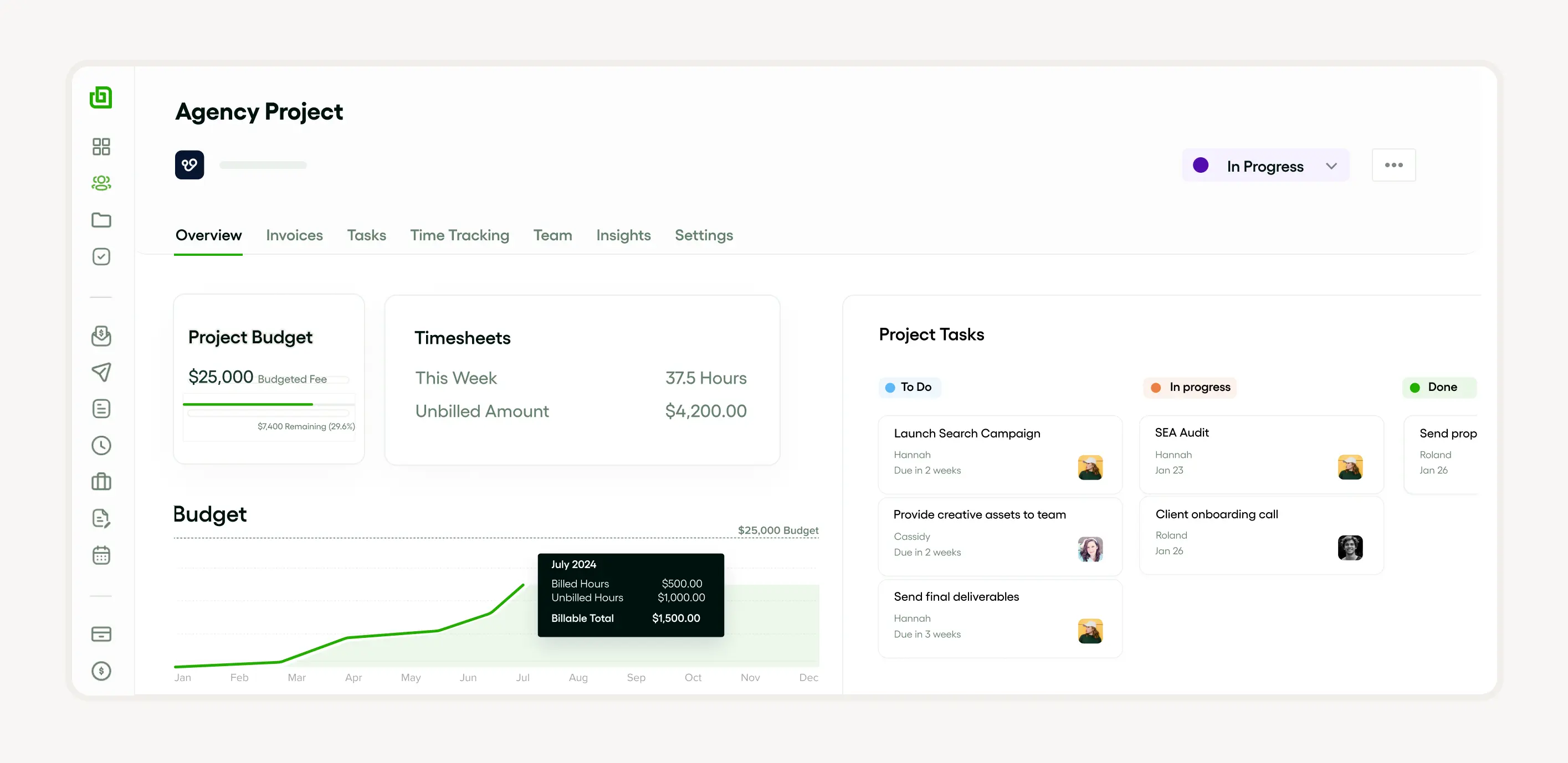
User-Friendly Interface
Despite its comprehensive features, Bonsai maintains a user-friendly interface. This ease of use is crucial for ensuring that team members can quickly adapt to the tool, reducing the learning curve and enhancing overall productivity.
How to effectively use visualization techniques
Visualization techniques can greatly enhance your communication skills, particularly when handling disagreements. One effective approach is detailed in our previous Disagreeing Sandwich Technique article. It helps facilitate pleasant and productive conversations, even when you and the other party hold conflicting views.
It comes as no surprise that to effectively use visualization techniques in data science; it is critical to choose the right charts or maps that best represent the data patterns and trends. The cool thing is by using visual elements in the visualization of data, one can facilitate the analysis of data and make decisions more efficiently.
Remember, the goal is to present data in a way that's easy to understand.
Creating a clear and detailed mental picture
It is beyond dispute that the graphical representation of data can greatly aid in highlighting trends in an accessible manner.
Through the creation of dashboards and diagrams, the remarkable thing is one can craft effective optical storytelling, and, inevitably, for individuals and organizations to make data-driven decisions becomes a piece of cake!
Adding emotion to your visualization
Notably, Injecting emotion into data graphical depiction can make visual elements more impactful and compelling. It’s an undeniable truth that emphasis on data trends and patterns can incite a sense of urgency, highlighting the need for immediate data-driven decisions.
Remember, it's about visual storytelling; shaping a vivid, engrossing tale through the use of graphs, charts, or maps instead of overloading them with raw numbers.
Consistency is key
It is important to highlight that visual storytelling often involves the use of numerous optical elements such as:
- Diagrams
- Graphs
- Maps
The remarkable thing about these tools is when appropriately used, they help illustrate data patterns in a more understandable manner.

It's a well-documented fact that by using interactive imagination, surprisingly, one can obviously take the concept a step further by making use of technology to drill down into charts and graphs for more detail.
Particularly, dashboards are an excellent tool for displaying data trends graphically. What’s interesting is with dashboards, it’s astonishing how organizations can manage and interpret substantial data!
Overcoming common challenges in visualization
Overcoming challenges in the graphical depiction of data involves the effective usage of visual elements, such as charts, graphs, maps, and diagrams.
The key is to appropriately use these optical tools to tell clear and compelling visual storytelling. It's a matter of fact that the analysis of data to identify data patterns and data trends is vital as it forms the backbone of any graphical depiction.
The effective use of dashboards also plays a significant role in providing comprehensive insights. It is imperative to note that while these techniques are often praised for their potential benefits, the numerous challenges they present cast a shadow on their actual effectiveness.
As a consequence, without addressing these issues, visualization remains a doubtful and unreliable method for the achievement of goals along with the manifestation of dreams.
Dealing with doubt and skepticism
It’s an extremely sad thing that when it comes to graphical presentation techniques for the achievement of goals, doubt and skepticism are inevitable companions. It’s a harsh truth that the efficacy of these techniques is often called into question, and for good reason.
What’s obvious is dealing with doubt and skepticism is integral in data science. It's crucial to realize that the interpretation and comprehension of visualization of data hinges on graphical representations such as charts, graphs, etc.; yet sometimes, it can incite doubt.
On the other hand, note that skepticism arises when optical elements fail to comprehensively portray data patterns and trends. It’s imperative to note that visual storytelling through dashboards is often suggested to enable data-driven decisions. However, the sorrowful thing about this approach is it can sometimes feel more like wishful thinking than a practical solution.
Staying motivated
To stay motivated in data science involves continuously exploring and appreciating the power of graphical representation. It is crucial to be aware of staying curious and open-minded about revealing data trends and patterns through optical storytelling.

This curiosity fuels a constant motivation for innovative solutions, along with insights. It's worth noting that another way is by effectively using dashboards as a means of graphical depiction of data.
It’s staggering how every successful data graphical presentation enhances your skill and validates your efforts!
Real-life success stories of visualization
One of the most powerful examples of the graphical depiction of data impact is how Spotify utilizes it to drive its business. One amazing thing is Spotify uses graphical representation to interpret massive volumes of data, identify data trends, etc. Their dashboards showcases:
- Songs' popularity
- User behaviors
- Global music patterns
It’s widely recognized that a leading global company, Airbnb, has also harnessed the power of data graphical presentation. Using dynamic maps and visuals, it’s just astonishing how Airbnb conveys its market's scope and health!
Successful individuals who used visualization
It’s beyond dispute that many successful individuals have extensively used graphical depiction to make data-driven decisions. It's well known that Jim Carrey, for instance, is known to have used this technique to further his acting career.
Similarly, it’s fascinating to find out that Arnold Schwarzenegger visualized his success in bodybuilding and politics through this technique.
But the sorrowful thing about this technique is there are numerous instances where individuals have employed these methods without success.
One notable example involved aspiring entrepreneurs who reportedly visualized their business success meticulously; however, ultimately failed to bring their visions to life. Also observers claimed that the reliance on graphical depiction did little to compensate for the harsh realities of the business world.
Companies that use visualization techniques
Companies in various sectors such as:
- Technology
- Healthcare
- Finance
- Marketing
Fascinatingly, companies in the above-mentioned sectors widely use these techniques so that they can enable data-driven decisions. It's well known that tech giants like Google, and Microsoft make use of data visualization to simplify complex data analytics.
The remarkable thing is financial organizations like JPMorgan and Goldman Sachs employ graphical representation in their data analysis approach.
Tools and resources to enhance visualization
It’s crucial to highlight that there are a plethora of tools and resources available to enhance imagination. These include but are not limited to diagrams, charts, graphs, maps, and dashboards.
It is safe to say that all these visual elements aid significantly in the analysis of data and optical storytelling.
What’s worrying is in spite of the abundance of tools and resources touted to enhance graphical depiction, their actual effectiveness remains highly questionable. Shockingly, numerous apps, books, etc. courses claim to provide the ultimate guide to mastering visualization techniques, but their results often fall short of expectations. We hope that the following resources and tools we give description will help you to enhance the graphical presentation in your journey.
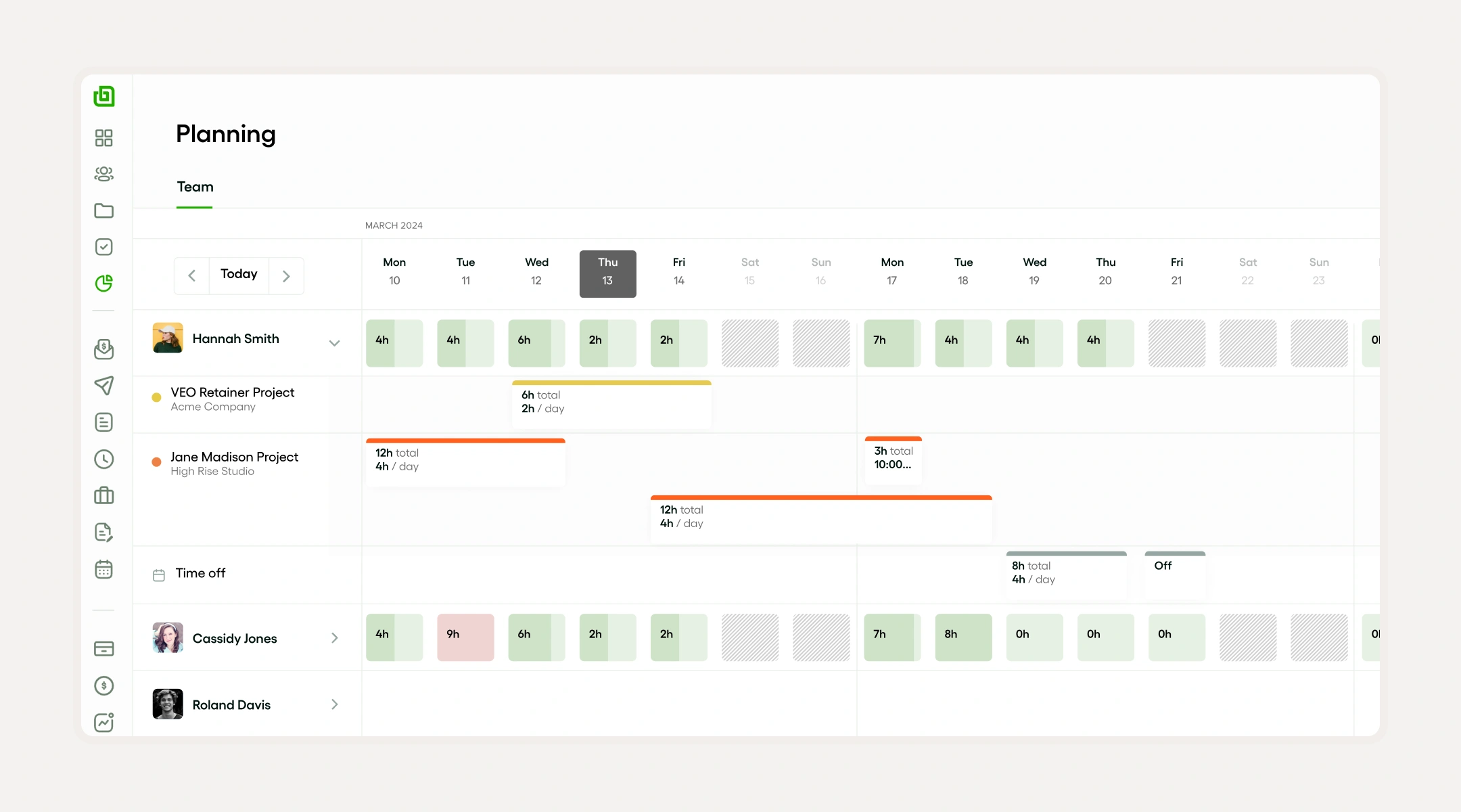
Bonsai for Capacity planning
Books on visualization
For enthusiasts of data science, there is good news! And the enthusiasts of this field will be cheerful to hear that there are several compelling books focusing on graphical presentation. It’s interesting to point out that these books explore the principles and techniques of data visualization.
Some renowned titles include 'Storytelling with Data.’ The interesting thing about this book is it introduces the basics of optical storytelling through diagrams and dashboards.
It is relevant to mention that 'The Functional Art' provides in-depth knowledge of the graphical representation of data.
Apps for visualization: headspace and calm
One thing to be noted: ‘Headspace and Calm’ are two apps that leverage the graphical depiction of data to enhance user experience. It is apparent that they transform complex data patterns into graphical representations. Usually, this makes it easier for individuals to follow their progress and make data-driven decisions.

But it’s not all sunshine and rainbows for Headspace and Calm apps. Firstly, the cost can be a significant barrier. The sad thing about both Headspace and Calm is they offer limited free content.

The bad news is the majority of their features are locked behind a subscription paywall. And the worst thing is that this can be discouraging for those who are hesitant to invest in an app without being fully convinced of its benefits.
Plus it was reported that the structured nature of these apps does not suit everyone. What’s sorrowful is that the critics argued that graphical depiction is a deeply personal practice that varies greatly from person to person. The worrying thing about the guided sessions is these two apps are too rigid and generic, and, unfortunately, stifle individual creativity together with the personalization necessary for effective graphical presentation.

Manage your team capacity with Bonsai
Conclusion: the impact of visualization on achieving goals and manifesting dreams
It is safe to say that visualization, particularly through graphical representation significantly impacts the achievement of goals and manifestation of dreams.
One thing is proven: Through data imagination, one can easily understand complex data trends and patterns, thereby making efficient, data-driven decisions.
Evidently, the power of graphical depiction also lies in its ability to effectively convey narratives via visual storytelling that leverages various optical elements to clarify and translate volumes of data into an easily digestible form.
