


There is no doubt that creating an effective waterfall chart in Excel is quite simple. Begin by inputting your data series that includes:-
- The starting value
- End value
- Positive values
- Negative values
Then, insert a stacked column chart. The cool thing is one can then modify it into a waterfall chart by adjusting the Format Data Series.
Furthermore, to demonstrate incremental changes and show any subtotals clearly, add connector lines.
One thing is for sure: Accurate representation of positive and negative changes distinctly makes your chart easier to understand. What’s fascinating is you can structure this into a vertical waterfall chart by altering the chart elements as needed.
Introduction to Waterfall charts
It's well known that waterfall charts are also known as bridge charts. The noticeable thing is it visually depicts the incremental changes between a starting value and an end value.
Remember, this chart effectively highlights both positive values and negative values, showing how an initial value is affected by various factors.
What’s noticeable is in its setup, the Format Data Point and Format Data Series can be used to highlight certain aspects of the data, while subtotals can be added for clarity.
Depending on the nature of the data, it’s fascinating how one could choose to create a traditional or a vertical bridge chart!
Consequently, you can add a meaningful chart title to improve the overall understanding of this chart.
What is a Waterfall chart?
The notable thing about this chart is it is a form of data visualization that helps in understanding the cumulative effect of sequentially introduced positive or negative values. Certainly, these intermediate values can either be represented by columns, which are color-coded to distinguish between positive and negative values, or by connector lines. It’s imperative to mention that starting and ending values are represented by total columns, and in-between values are usually depicted by floating columns.
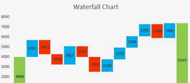
Remember that major components of the waterfall chart include:-
- The data series
- Chart elements such as the chart title along with the chart legend
- Format Data Series and Format Data Point properties
Interestingly, the waterfall chart could be horizontal, but the vertical waterfall chart is a common variation.
What is a Bonsai App?
The Bonsai App stands out as a comprehensive solution for project management, tailored to meet the needs of professional service providers, and small businesses. Its all-in-one platform is designed to streamline the entire workflow, from proposal to payment. With Bonsai, users can create proposals, draft contracts, track time, manage tasks, and send invoices, all within a single ecosystem.
One of the key advantages of Bonsai is its user-friendly interface, which simplifies project management without compromising on functionality. Users can easily navigate through different modules, making project setup and execution both intuitive and efficient. The app's task management system allows for detailed task creation, assignment, and tracking, ensuring that every project component is under control.
In essence, Bonsai is more than just a project management app; it's a holistic system that supports the entire lifecycle of a project. It empowers users to manage their work efficiently, collaborate effectively, and grow their businesses with confidence. Whether you're a freelancer juggling multiple clients or a small business looking to optimize operations, Bonsai provides the tools necessary to manage projects with precision and professionalism. It's a smart choice for anyone looking to enhance their project management strategy and achieve better outcomes.
Why Use a Waterfall chart?
It is a fact that this chart is an effective tool when you want to visualize the cumulative effect of sequential positive and negative values. The remarkable thing about this type of chart is it displays the following things:-
- Starting value
- Incremental changes
- End value
Subsequently, this shows if initial values have been increased or decreased by subsequent data series.
Evidently, its 'waterfall' structure helps to distinguish between the positive and negative changes with the help of different colors. With functions like 'Format Data Point', the amazing thing about this chart is it further aids in making complex data sets more comprehensible.
One thing is for sure: The vertical waterfall chart is particularly useful in finance for depicting how an initial value is altered by various factors.
Understanding the basics of Excel
It is worth noting that Microsoft Excel is a powerful tool with many functionalities.
One of these is creating a waterfall chart that visually represents data series.
The best thing about this is users can manipulate the Format Data Series and Format Data Point options to refine their charts.
Typically, examining your waterfall chart, you will notice incremental changes, each bar starting from the ending value of the previous one.
What’s amazing is the chart tallies up subtotals that help track progressive addition or subtraction. It’s just fascinating how this enables a good visual analysis of the data!
Getting familiar with Excel interface
It's a matter of fact that the Excel interface is user-friendly and accommodates a variety of features.
What’s interesting is one of these features includes creating a waterfall chart.
Clearly, the chart essentially visualizes incremental changes, depicting the flow and end value of your data series.
The noticeable thing is depending upon the nature of the data, this can be represented as a vertical waterfall chart. It’s astounding how advanced features allow customization and enhancement of the chart! For example, you can format data points.
Understanding Excel functions and formulas
It's beyond dispute that Excel offers a plethora of functions and formulas.
One such function is creating a vertical bridge chart. Typically, a waterfall chart includes various chart elements such as a chart title, connector lines, etc.
What’s noticeable is other important features include Format Data Point and Format Data Series which allow customization to emphasize specific aspects of the data. One thing is for sure: Subtotals can also be incorporated to summarize or break down the incremental changes.
The crucial role and importance of project management
Project management in Bonsai plays a crucial role by providing a centralized system for overseeing tasks, deadlines, and team collaboration. It ensures that projects are executed efficiently, with clear communication and resource allocation. This importance is reflected in Bonsai's ability to streamline workflows and enhance productivity across teams.
Moreover, Bonsai's capacity planning tools help users forecast and manage their workload, preventing overcommitment and burnout. The platform's reporting features provide valuable insights into project performance, financial health, and team productivity.
Preparing your data for a Waterfall chart
It's crucial to be aware that preparing data for a waterfall chart involves organizing your information into a format that can be easily understood and visualized.
Consequently the data series should be pre-arranged in the correct sequence. Please make sure that both positive values as well as negative values are correctly differentiated.
It is relevant to mention that include subtotals at appropriate intervals to show the accumulative effect of incremental changes. The remarkable thing about Format Data Series as well as Format Data Point tools is they can help in making precise adjustments.
Organizing your data
It is relevant to mention that organizing your data for a bridge chart requires understanding various elements like:-
- Series of data
- Starting and ending values
- Incremental changes
Definitely, the data series represents the sequence of data points that you are plotting. Don’t forget that the starting value and end value represent the initial and final values of your series, respectively.
What’s worth mentioning is incremental changes show positive values and negative values as stairs reaching upward or downward.
In this chart, there are other important elements to consider such as the chart legend, and connector lines.
It should be acknowledged that the chart legend helps identify different data series or categories, whereas the connector lines connect the end of one column to the start of the next column. It’s astounding how this shows the progress from one point to the other in a vertical waterfall chart!
The cool thing about chart titles is they give the chart a name and subtotals help summarize the data whenever necessary.
Formatting your data
It is safe to say that creating a waterfall chart involves careful formatting of your data. Commonly, the first step is identifying your starting value and end values, which need to be positive values.
What’s noticeable is key elements in the chart include the data series, which should be appropriately formatted using the 'Format Data Series' function and connector lines that link the data.
The good news is the chart's appearance can be enhanced by using the 'Format Data Point' function. If one avoids subtotals in a vertical bridge chart, one can maintain simplicity and clarity.
Step-by-step guide to creating a Waterfall chart in Excel
To create a waterfall chart in Excel, start by selecting your data series that consists of a starting value, end value, and any incremental changes.
Then, Navigate to the 'Insert' tab and choose 'Waterfall chart' from the chart options. Particularly, format the chart to make it more understandable.
It is important to mention that for a clearer depiction of your chart's flow, consider adding connector lines to link the columns.
Commonly, in the case of complex data, you can include subtotals to summarize interim results.
Step 1: selecting your data
It is noteworthy that the first step in creating a waterfall chart is selecting your data. What’s notable is that the data should clearly distinguish between positive values and negative values to display incremental changes accurately. Your data series should comprise:-
- Starting values
- End values
- And potentially, subtotals
When selecting your data, don’t forget to focus on properly formatting your data points and data series for clarity.
One thing is for certain: The chart legend and chart title are crucial chart elements that should be carefully chosen as well. Remember, the goal is to construct a vertical bridge chart that visually embodies the flow of data.
Step 2: inserting a Waterfall chart
Interestingly, after setting up your data in Excel, you can begin inserting a waterfall chart.
And, for doing this, you need to first select the range of data, then navigate to the 'Insert' tab and choose the 'Waterfall' chart option.
The cool thing is upon insertion, the waterfall chart provides a view of positive values and negative values! Note that this can be easily interpreted.
Additionally, you can add chart elements for a more comprehensive view.
Step 3: customizing your Waterfall chart
There is no doubt that customizing your waterfall chart involves several elements. One may want to tweak the positive values and negative values in the Format Data Point or Format Data Series sections.
It's worth noting that altering the color distinction between positive and negative increments makes the chart more visually appealing. What’s fascinating is further customization can be done to the chart elements such as the chart title and chart legend.
It's no secret that these are crucial for a proper understanding of the chart. Also, consider adding or removing connector lines between data series, as they can help outline incremental changes and subtotals on the chart.
Lastly, you may switch between a horizontal or vertical bridge chart format depending on your preference or the nature of the data presented.
Advanced tips for enhancing your Waterfall chart
It is evident that to enhance your waterfall chart, you should focus on a few key aspects. Clearly differentiate positive values and negative values.
The good news is one can do this by using the 'Format Data Series' or 'Format Data Point' options to apply different colors.
And then, consider adding connector lines between data series to illustrate the flow from the starting value to the end value.
It is important to highlight that you should utilize chart elements like the chart legend and chart title to provide clarity and context.
In addition, consider the use of subtotals in your vertical waterfall chart for added comprehension. It’s surprising how these tips can assist in making the bridge chart more insightful!
Adding data labels to your chart
It's a well-established fact that in a vertical waterfall chart, adding data labels improves readability and provides more information about positive and negative values.
Data labels can be added via the option:- 'Format Data Series'/ 'Format Data Point'.
The best thing about these labels is they will represent the incremental changes of your data series.
On a waterfall chart, connector lines serve to link the positive and negative values visually. What’s remarkable is these lines, as well as other chart elements like the chart title and chart legend, provide important details and context for the data presented.
It comes as no surprise that adding these elements can significantly improve understanding of the chart data. It is essential to understand that one can choose to compel the labels to display absolute values or merely the changes in values. Make sure these two things:-
- Are the labels visible?
- Can the readers easily understand it?
Remember to proofread and check your chart before finalizing it.
Changing the color scheme of your chart
It is crucial to realize that another important feature to consider when creating a waterfall chart is the color scheme. The remarkable thing is this not only includes the colors of the positive values, negative values, etc; but also the chart elements like the chart legend and connector lines.
There is no denying that customizing these aspects can help with readability and make your data more engaging.
The great thing is each data series in the chart can be modified for look and feel! Undoubtedly, striking the balance between colors can improve viewers' understanding of your vertical waterfall chart.
What's obvious is naming your chart elements can further improve the presentation of your waterfall chart. Not only does it enhance visual appeal but it provides informational clarity to your audience.
Adding a trendline to your chart
It is generally agreed that including a trendline in the bridge chart can enhance the visualization of a sequence of the following things:-
- Positive values
- Negative values
- or even incremental changes
The trendline adds more context to the chart, especially when interpreting the overall pattern of data series.
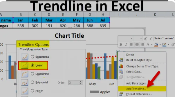
It is important to mention that to add a trendline, you need to click on any point on your waterfall chart, and, after that, under Format Data Point or Format Data Series, you can find options to insert a trendline.
Please make sure to customize it fittingly for your vertical waterfall chart. A trendline may not always be needed, but remember that if it helps in conveying information more precisely, you should definitely consider adding it.
What’s notable is one should pay attention to the chart legend while formatting the trendline to make sure it is easy to understand.
Common mistakes to avoid when creating a Waterfall chart
It is beyond question that when creating a waterfall chart, make sure to avoid common mistakes that may affect your data's representation.
One thing is clear: One of the most common errors is misrepresenting positive values and negative values. The worrying thing is this can lead to incorrect interpretations of incremental changes.
Always ensure your starting value and end value accurately reflect the data series. Furthermore, avoid ignoring the importance of chart elements in a vertical waterfall chart. It's indisputable that these elements assist in interpreting the chart.
Mistake 1: using inappropriate data
It is important to highlight that setting up a waterfall chart requires careful attention to detail, especially while inputting data.
One common mistake is using inappropriate data. It’s a sad thing that this can totally misinterpret the outcome of your chart.

The chart heavily relies on positive values, negative values, along with the starting value. Sadly, mistakes in these areas affect the end value significantly.
It’s a matter of fact that a waterfall chart precisely visualizes incremental changes that lead to a final value, and it often involves subtotals.
What's worth highlighting is that the data series is crucial in the process. Any error can affect the final result. One thing is proven: Creating a vertical waterfall chart without understanding these elements leads to confusion and distortion of the data representation.
Mistake 2: overcomplicating the chart
It's proven that one common mistake when creating a bridge chart is overcomplicating the chart. Generally, this can be done by trying to incorporate too many data series, or by failing to clearly differentiate between positive and negative values.
What’s noticeable is users should avoid adding too many chart elements such as unnecessary connector lines and subtotals. Formatting can ease understanding.
Remember to include a chart title and a chart legend for interpretation ease. Surprisingly, less is always more with charts! What’s worth mentioning is that extraneous information can confuse the viewer.
Mistake 3: ignoring the chart layout
It is imperative to note that ignoring the chart layout when creating a waterfall chart can be detrimental. We know that the chart layout comprises various elements. Evidently, the data series included in the chart layout define the starting value, end value, etc.
The Format Data Series as well as Format Data Point options enable you to specify details like subtotals and incremental changes. It's no secret that these options add more clarity to the waterfall chart and help interpret the data better. The worst thing is not paying attention to these aspects may result in an inefficient and poorly constructed chart.
The best thing about properly arranged chart elements is they provide clear visuals, especially when dealing with complex data.
Choose Bonsai for efficient team task management
Choosing Bonsai for team task management means embracing efficiency and clarity. Its intuitive interface simplifies task delegation, tracking, and completion. Teams can customize workflows to match their processes, ensuring a seamless integration into their daily operations. Bonsai's time tracking aligns with project milestones, providing real-time insights into productivity levels.
The platform's financial tools aid in budgeting and invoicing, making it easier to manage project costs. By consolidating these features, Bonsai empowers teams to focus on delivering quality work, while the app handles the intricacies of task management and administrative duties.
Conclusion: the power of Waterfall charts in Excel
One thing is for sure: Waterfall charts in Excel enable clear presentation of positive and negative values that allows comprehensive visualization of data series leading from a starting value to an end value.
Remember, the easy-to-understand increase and decrease with connector lines highlight incremental changes and subtotals. The cool thing is it demonstrates the collective impact of successive data points.
What’s remarkable is the formatting options give precision control over the chart elements. As a result, this helps to customize and emphasize specific data points. It’s obvious that this makes the vertical waterfall chart a powerful tool for data analysis.
